Along with technology the changes in worship graphics are growing exponentially. I still remember the days of black words on a white over head projector screen. Yet, if you are in a ministry that tends to focus on the technologically savvy it’s still important to remember basic design concepts along with implementation of new technologies.
1. One thing dominates the screen. When you look at a well-designed page, there is usually one dominant feature that your eye will gravitate towards.

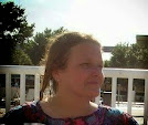
What is the first thing your eye is drawn to in this example?
All I see is the face. Eyes particularly are drawn to faces.
All I see is the face. Eyes particularly are drawn to faces.
2. Minimize typeface variety. Don't mix and match multiple fonts just because you are able. Stay away from weird type styles - you don't want your worship to resemble a used car commercial.Choose one or two nice, readable fonts and stick with them throughout your service. Times Roman is bland - start with Arial, Verdana or Helvetica.
Notice the difference in readability in the following samples. Particularly note the difference between serifs (the details on the end of the letters) and sans serif.
Notice the difference in readability in the following samples. Particularly note the difference between serifs (the details on the end of the letters) and sans serif.

Generally a font that is crisp and clean and well spaced out is easier to read. My personal belief is that serifs tend to get in the way.
Whenever you use a new font, try it out on the screen before worship. What looks good on your computer monitor might not look so hot enlarged in 40 point font.
Whenever you use a new font, try it out on the screen before worship. What looks good on your computer monitor might not look so hot enlarged in 40 point font.
3. Easy to read text. Tiny text is hard to read on screen. Centering lyrics is the trend, but you learn Art 101 college class that this tires the eye - lyrics should be "flush left" - like a newspaper column. See how hard it is to read the following. The eye has to search for the beginning of each line:  4. Use caution with bells and whistles. It’s always fun to find a new technique. But, don’t overdo it. Not every song, not every week. Currently this is motion graphics.
4. Use caution with bells and whistles. It’s always fun to find a new technique. But, don’t overdo it. Not every song, not every week. Currently this is motion graphics.5. Pay attention to details. My favorite story is there is a motion graphic on a popular worship media program that has a deer peacefully drinking at the edge of a calm body of water. In the far background there is a lion stalking the deer.
As always prayerful consideration in all you do. That is a given.
What are your design guidelines (pet peeves) about worship graphics?
No comments:
Post a Comment